|
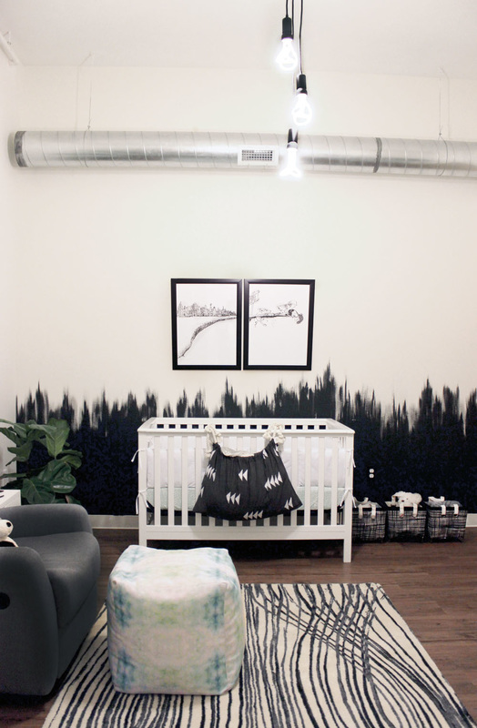
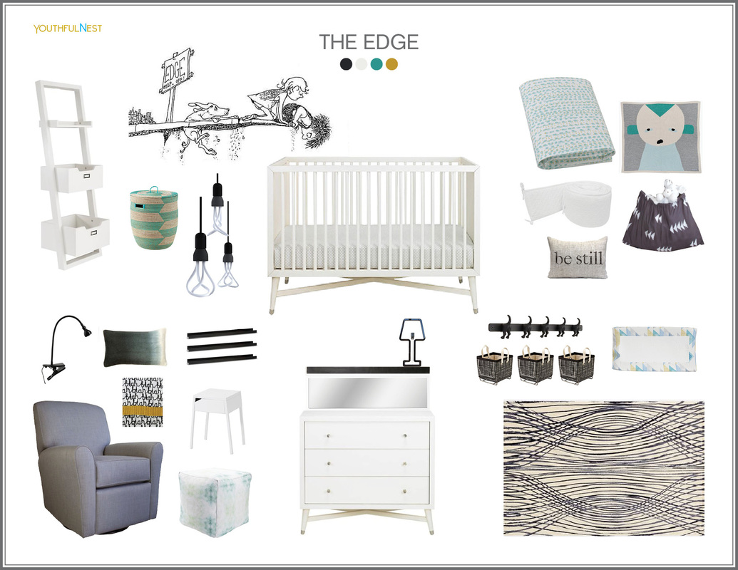
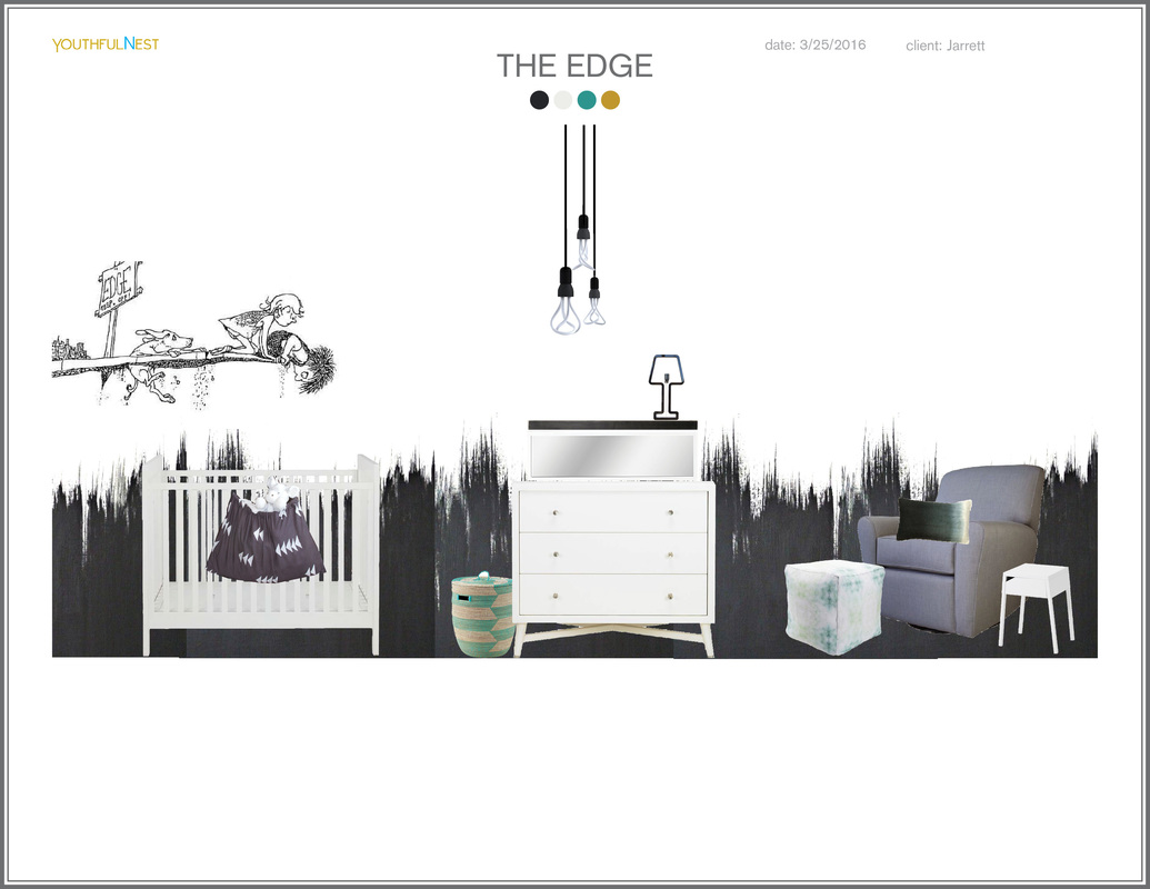
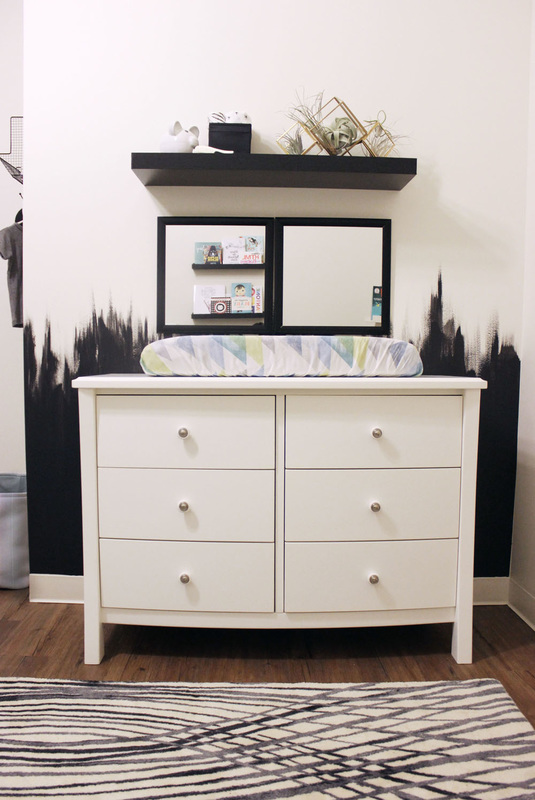
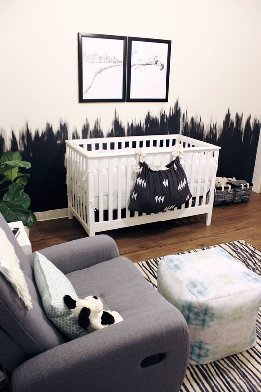
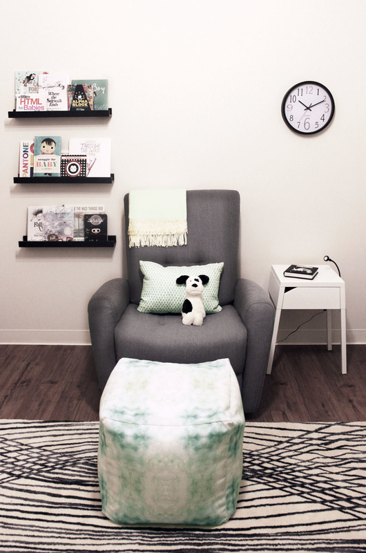
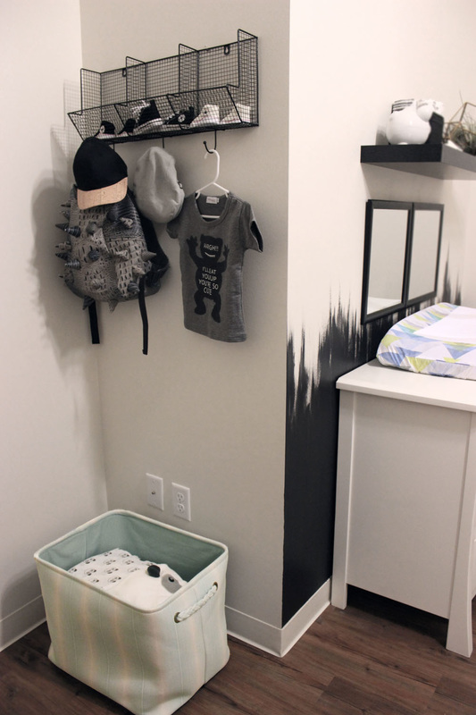
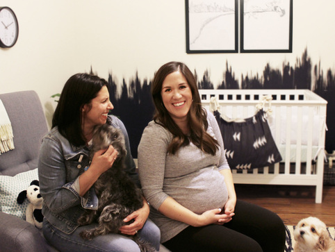
I was looking through dozens of room images taken the day before at a photo shoot capturing the Jarrett’s new nursery, when I received a text from Stephanie, “Thank you for a great room! I just felt like sleeping in there last night ;)”. I simply replied, “You’re welcome!” I then smiled and thought to myself, ”You’ll get plenty of chances to sleep in that room!”. This is the kind of reaction we’ve been getting from parents after helping them design their kids’ spaces with the same approach they give the rest of their home. The truth is as moms (and dads) we spend so much time in the nursery those first couple years I think it should be more appropriately renamed the “hersurey” or “mom’s room". Which is why I encourage clients designing a nursery to consider what style suits THEM best. This is part of the YouthfulNest design philosophy which stresses the importance of creating a space that makes parents feel comfortable and more confident to care for their newborn. Stephanie and Paul Jarrett live in Lincoln and already proud puppy-parents to Rex and Ruby. Not to mention they gave birth to a thriving start-up in 2012, Bulu Box, a health supplement company. I worked with Stephanie years ago on a design board and when I found out Stephanie was six months pregnant I sent her a congratulatory note and casually mentioned to let me know if YouthfulNest could help with her nursery plans. She replied saying they had given only a little thought to the nursery and were just planning on purchasing a few basic items and getting a hand-me down crib. After some back and forth e-mails they decided to give YouthfulNest’s online design services a go. "We only live an hour apart, but Lisa was able to work with us virtually to accommodate our busy schedules. When she did finally come to our home to help us set-up the room she demonstrated expert skill in pulling all that product together into one killer nursery." – Stephanie Jarrett To kick-off the design process we had a FaceTime consultation. Millennial dad-to-be, Paul, straight off the bat warned me that they didn’t want cutesy cartoon animals or candy-colored rainbows. While he admitted his wife’s requests for this space ruled supreme, he did share the one inspiration he had for the space – Shel Silverstein’s books. Specifically the illustration from the book of “Where The Sidewalk Ends”. It’s a black ink sketch of the two little kids and their faithful pup walking to the end of a cliff after passing a sign that reads “Keep Off The Edge”. With child-like curiosity, they peer over its edge. “LOVE IT!", was my reply. Then Paul shared more visual inspiration from Silverstein, soft watercolor illustrations…the exact antithesis of the black ink line drawings. Now I had a challenge! The last comment before ending our FaceTime consult was from Paul, who implored me to, and I quote, “Shock us.” The following online design steps provided Paul and Stephanie with a Project Overview, Style Board and Personal Boutique all up-loaded and viewed in their private, virtual Design Studio. However, after sourcing all these great products, the look was missing something… its “Edge”. I discovered an unusual wall paint technique on Pinterest – a solid paint color starting at the baseboard with a top edge finished with spiky brush strokes. It certainly was “edgy”, even a bit severe, so I knew it was just the right thing to kick this modern room style up a notch. After digitally presenting the room look, now starring the bold wall treatment, I held my breath until I received the initial client reaction. It came via a very public, but super positive Tweet from Paul, “We love it!!!. The walls are my fav :)”. With the green light from the client it was time to purchase product and install the room’s custom wall mural. I personally took on this paint project. Admittedly, I was slightly apprehensive as I opened that can of Colorhouse paint in straight-up black (Nourish .06). The Jarretts truly showed their trust in my abilities as they calmly wandered in and out of the room as I slathered their white walls with rich black color. This wasn’t your mom’s accent wall. This is a feature wall. It turned out so well that they were enthusiastic about letting me apply the technique to a second shorter wall. "She nailed it! We thought we had a pretty tough style request, she totally embraced it, down to the little touches like the designer light bulbs in the custom pendant or incorporating watercolor pastels without seeming babyish." – Paul Jarrett This room went from virtual inspiration to a very tangible and well-designed space in just over 4 weeks. The actual installation and placement of furnishings and décor took several hours. As with the previous digital e-design process, these clients did their fair share of work to get the room ready which helped keep the cost of hiring a designer affordable. The room’s final appearance resulted in a few high fives, hugs and even a couple doggie kisses for me from Rex and Ruby. How'd we do them walls? Where to get this room Crib : Target
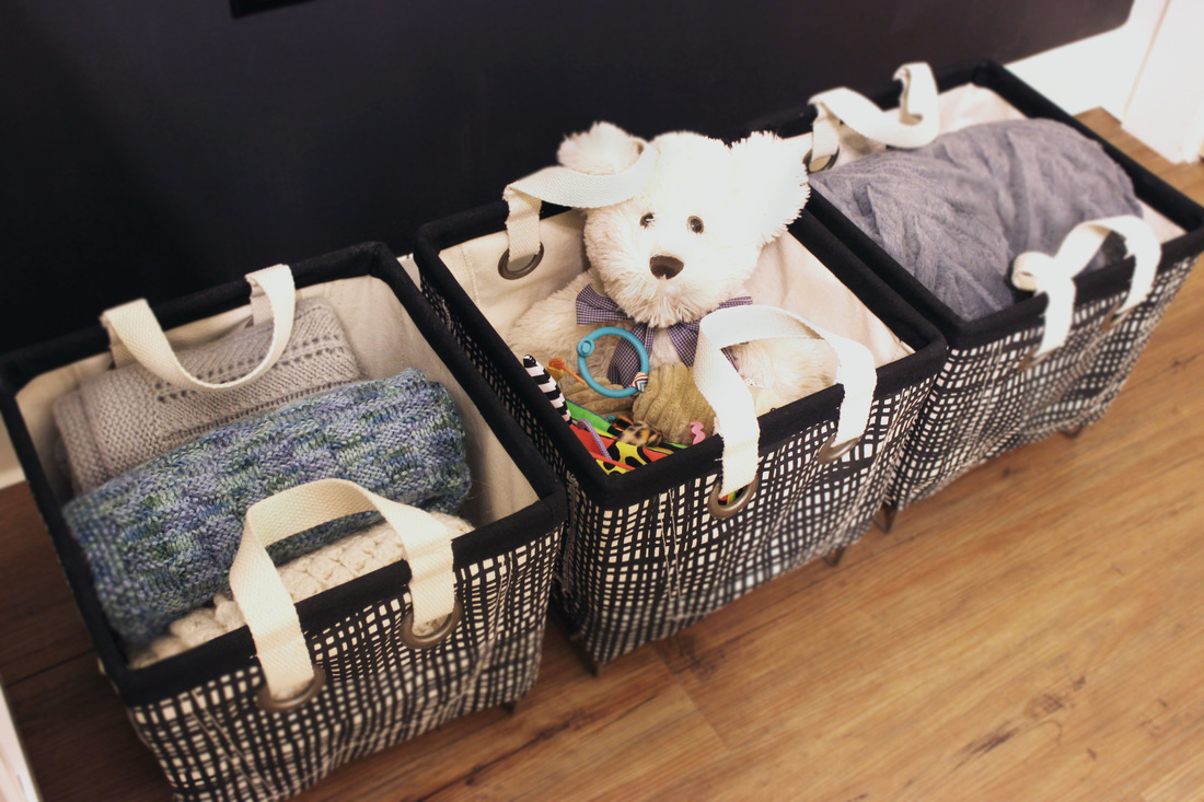
Dresser Changing Table : Target Crib Sheet : Dwell Studio Changing Pad Cover : Dwell Studio Glider : Target Crib Storage : YouthfulNest Black Wall Paint : Colorhouse Watercolor Pouf : Dwell Studio Throw Pillow : Anthropologie Decorative Throw : Anthropologie Rug : West Elm Pendant Light : DIY Color Cord Wall Storage : Target Three Storage Bins : The Land Of Nod Large Storage Bin : Home Goods
Bree
1/4/2019 10:50:50 am
Where did you find the Shel Silverstein wall art/prints? I found a photo of a wall similar to this where it was unfinished around the chair rail area but not spiky, more like buildings in a downtown skyline. Seems simple enough but then I cam across your blog and saw where you found the technique on Pinterest and wondered if you would share the technique with me so that I made sure not to mess this up. I'm switching my sons room over from nursery to toddler and wanted to make it edgy and this is exactly what I'd like to do. Thank you for your time! Comments are closed.
|

