|
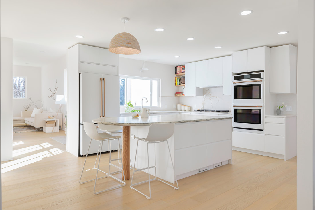
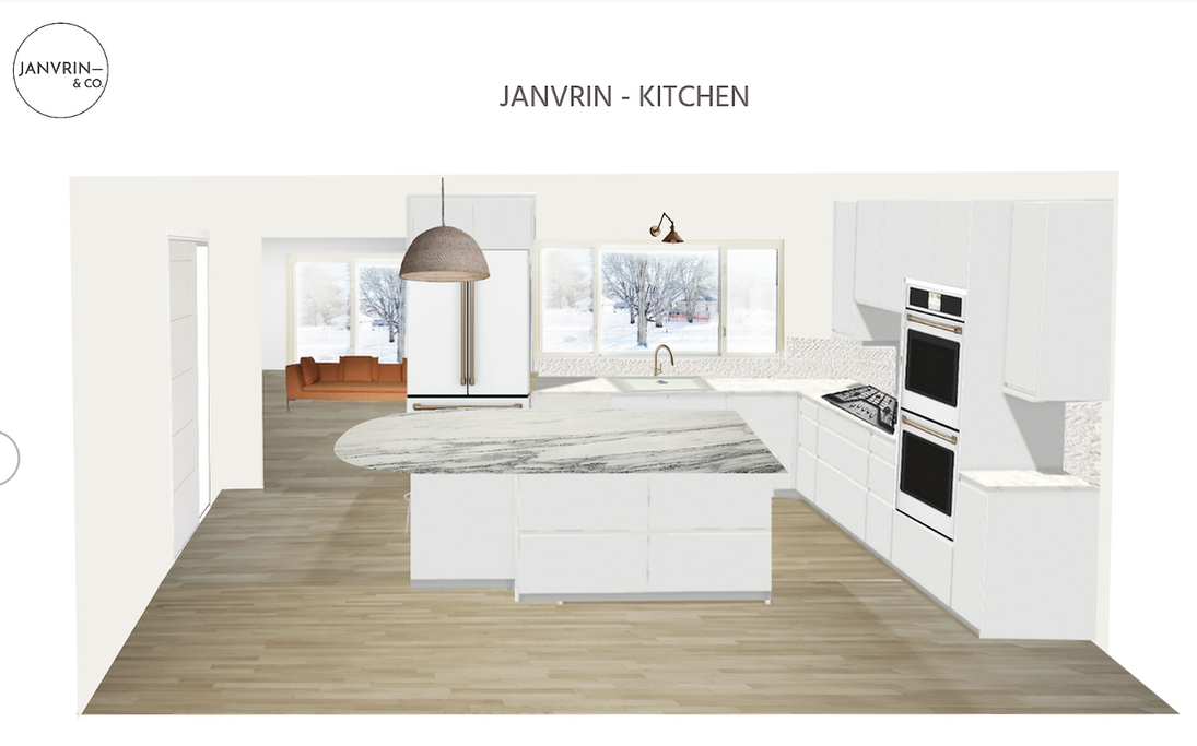
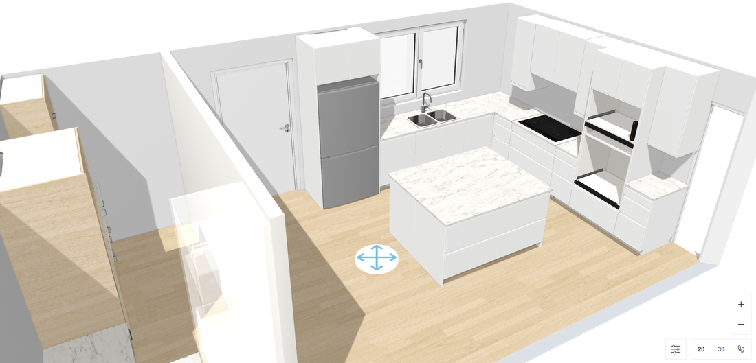
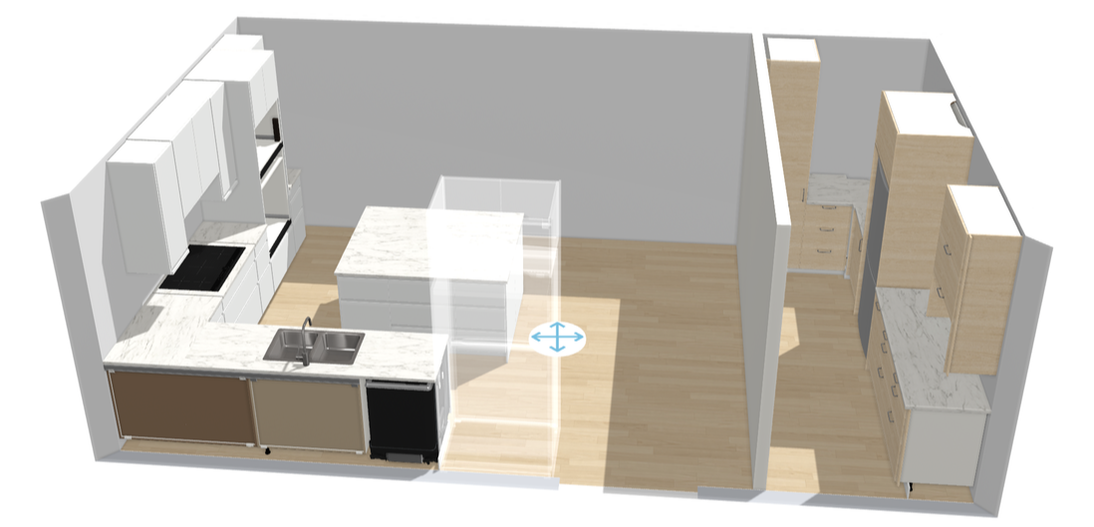
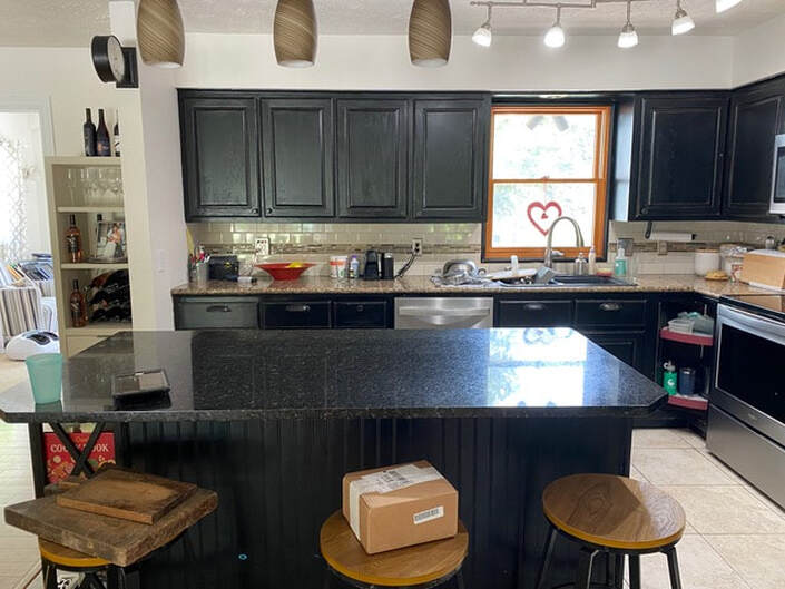
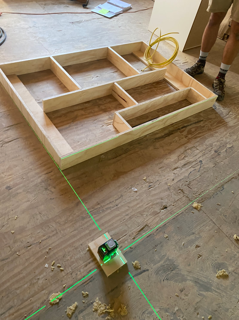
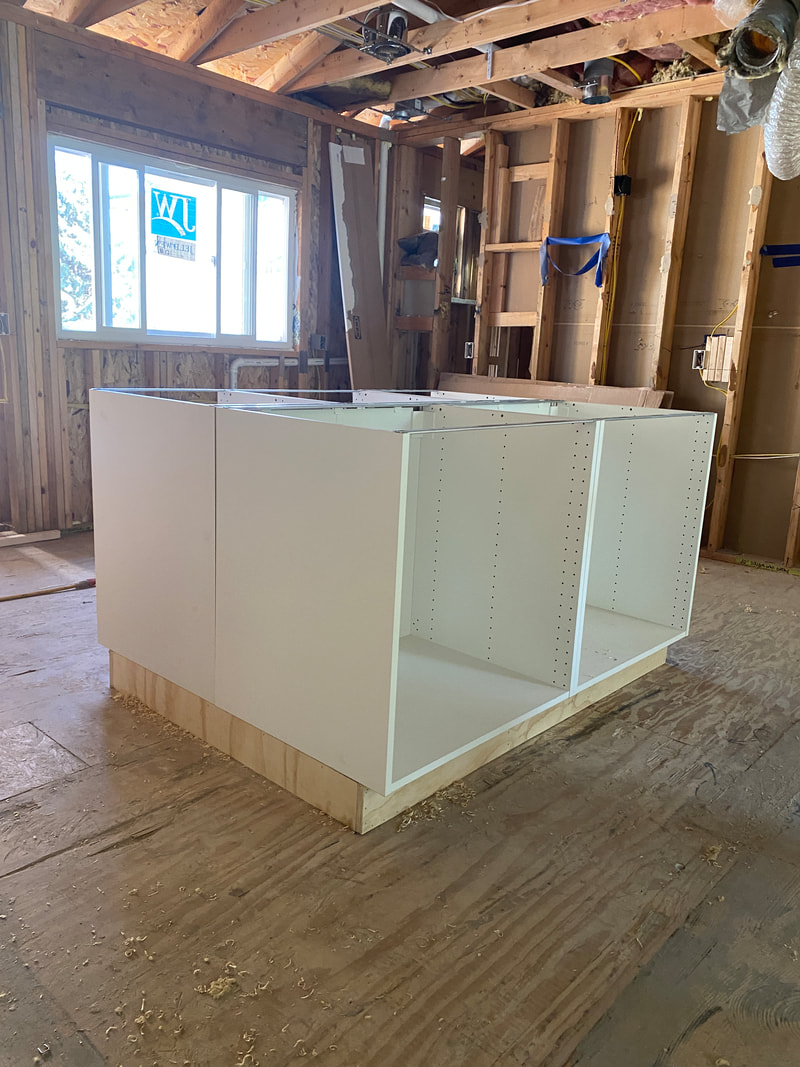
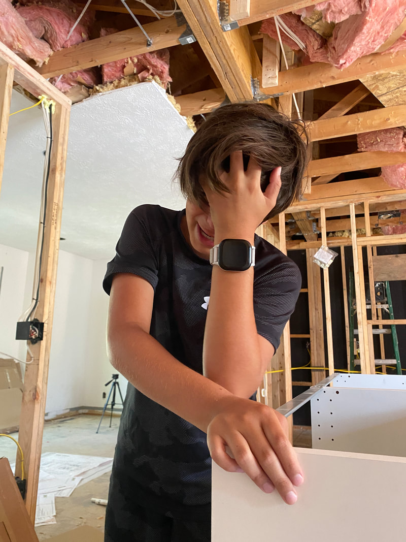
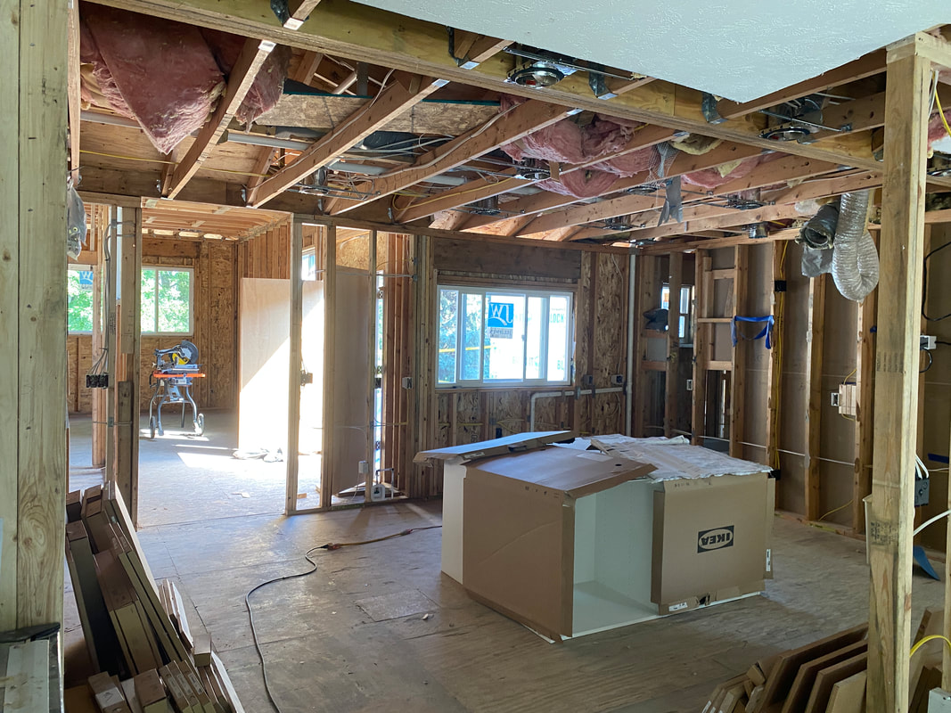
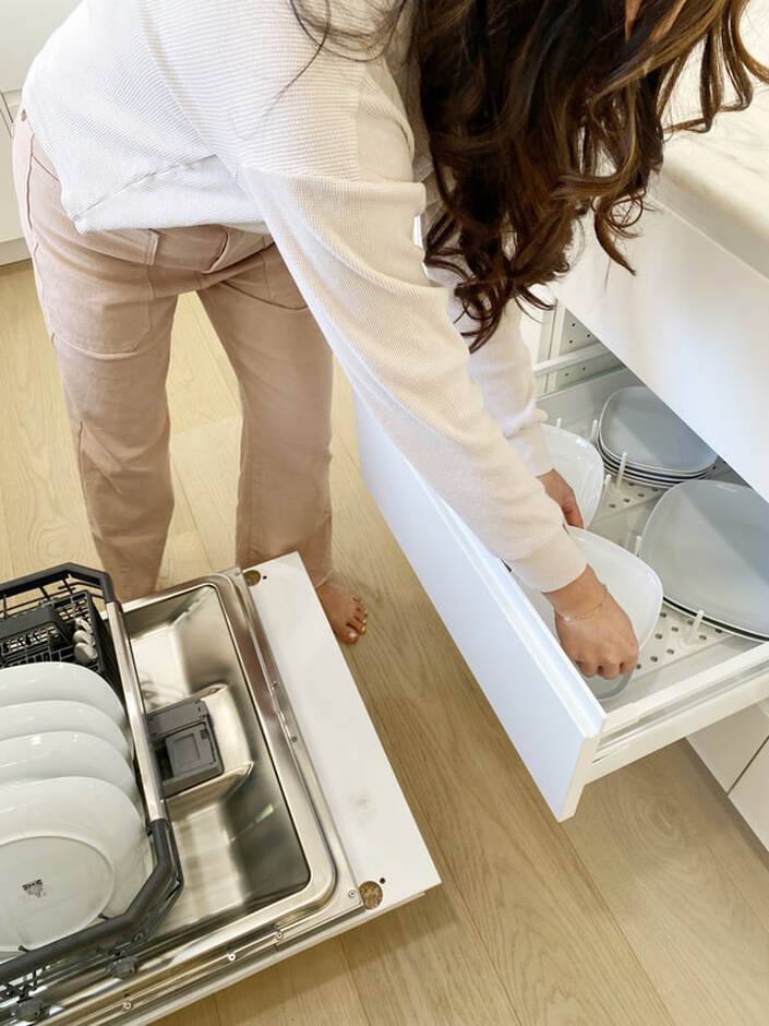
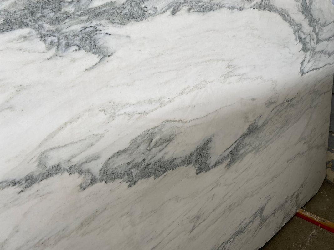
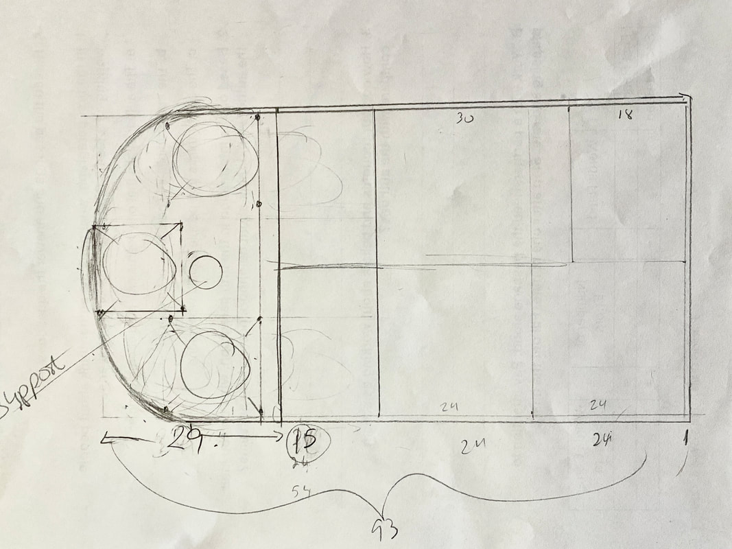
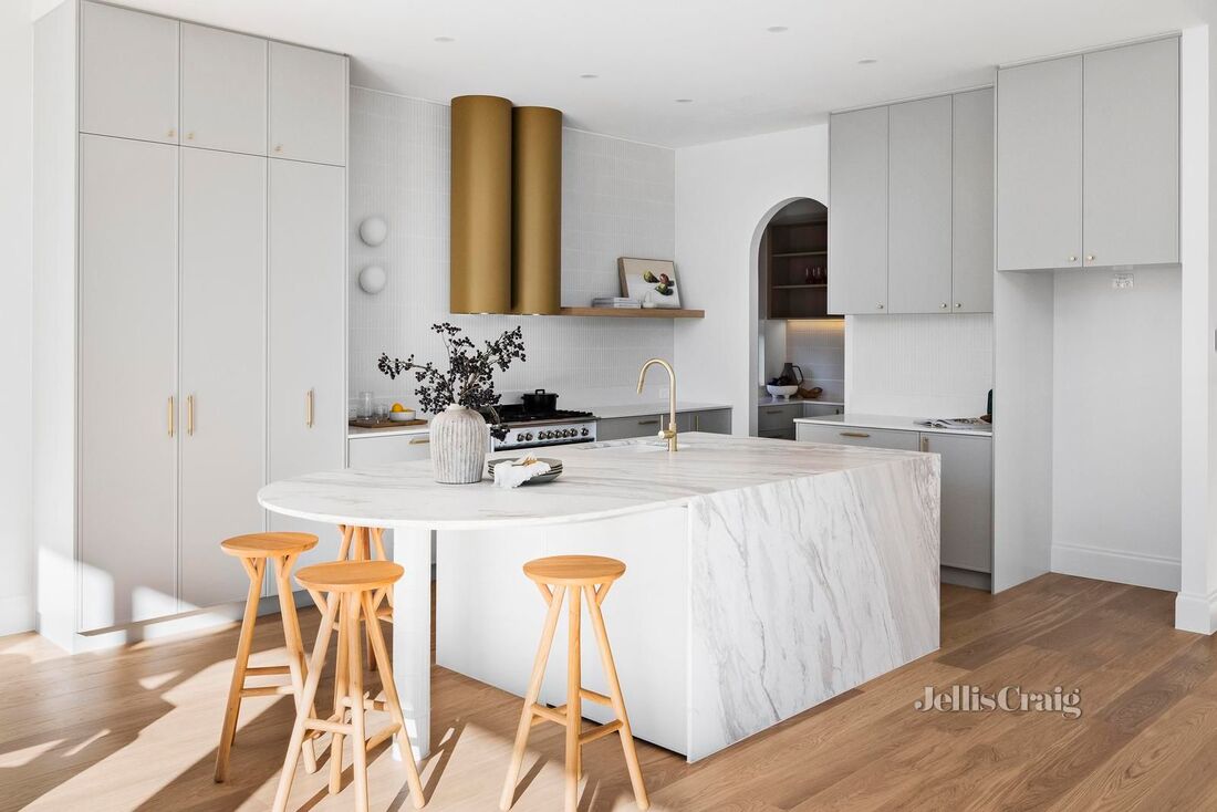
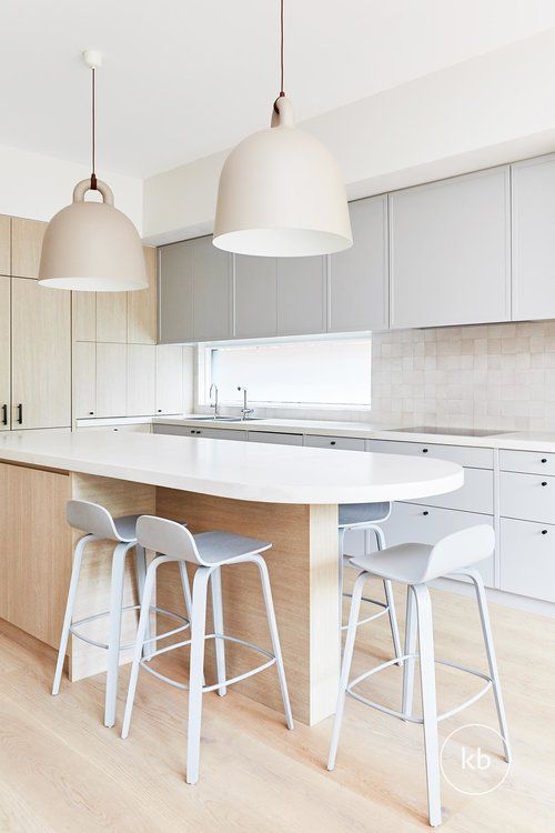
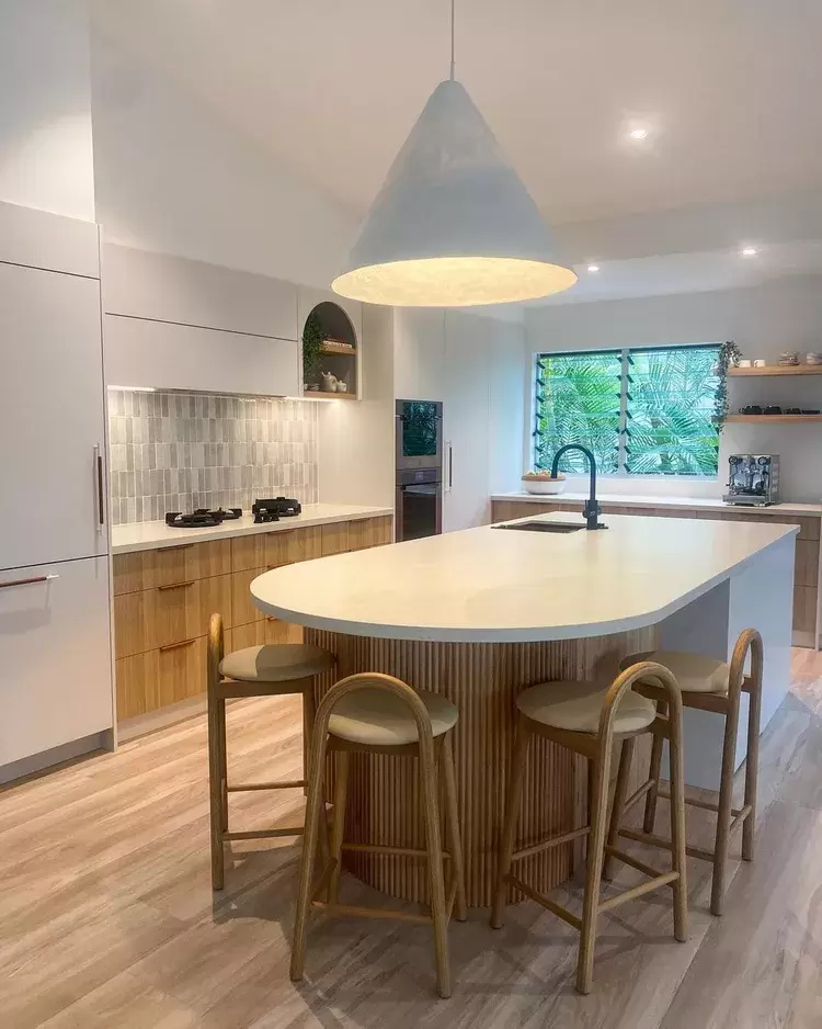
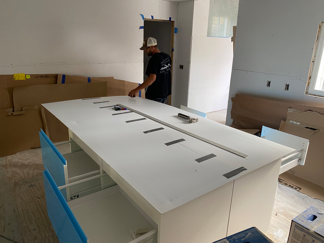
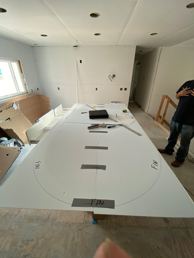
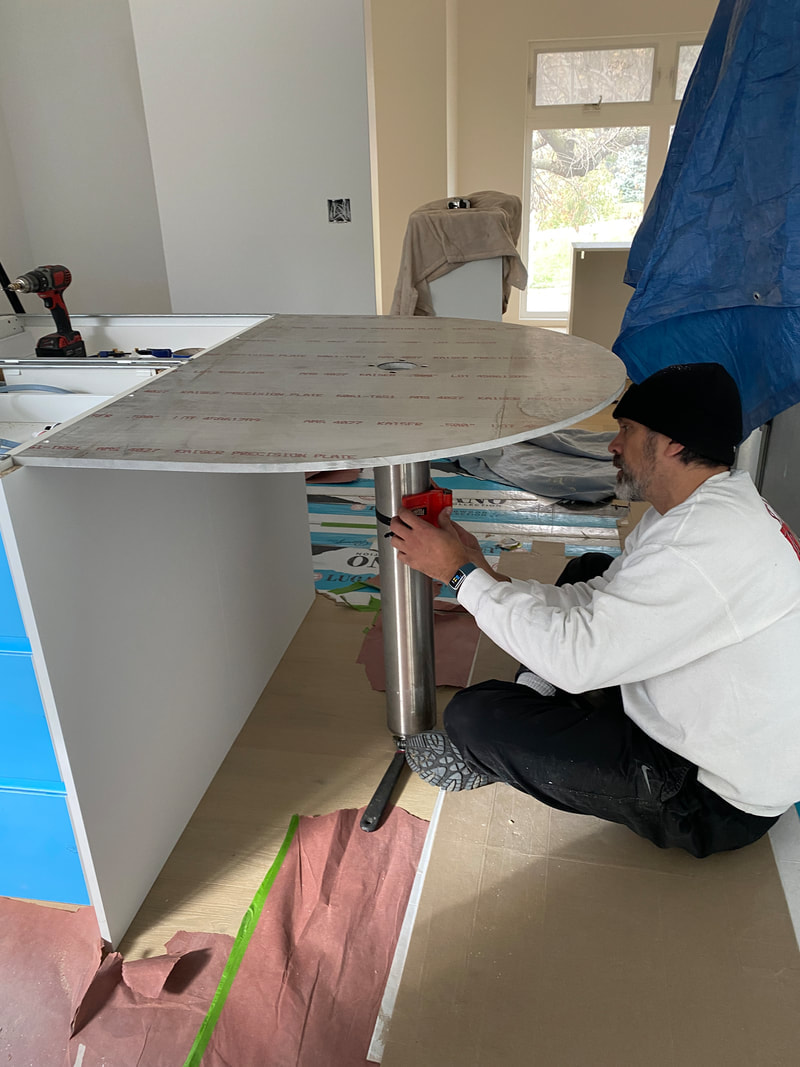
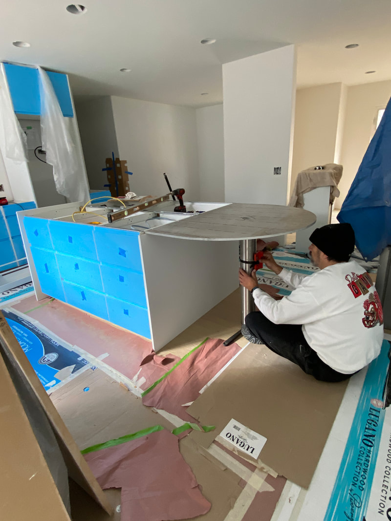
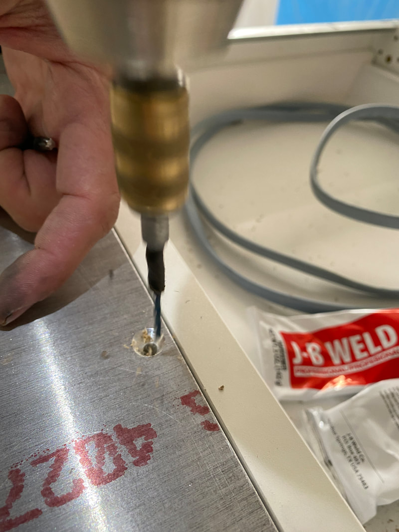
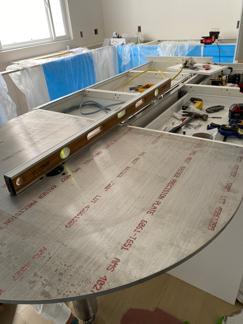
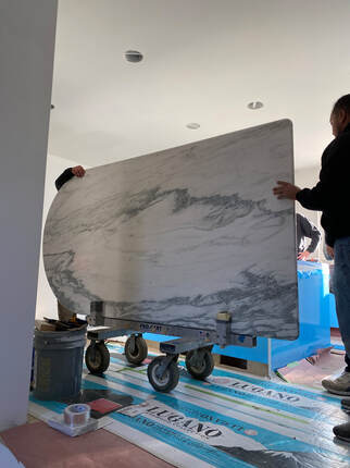
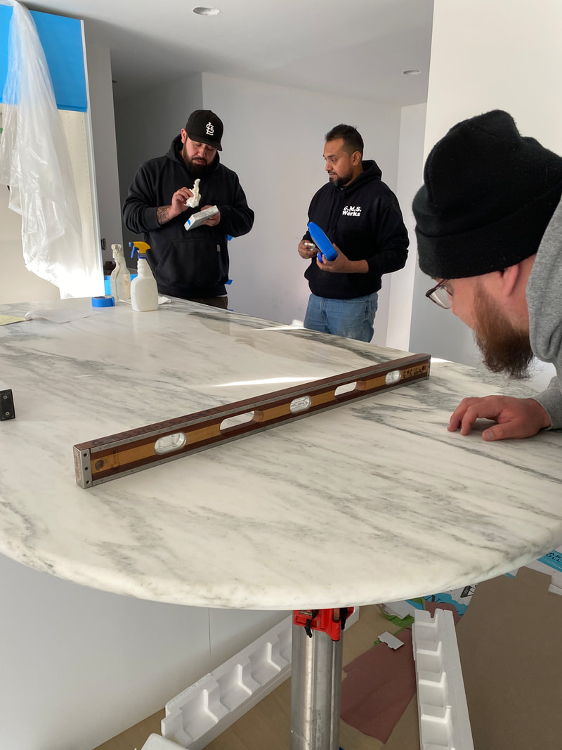
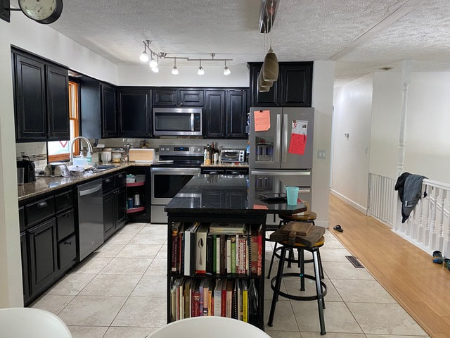
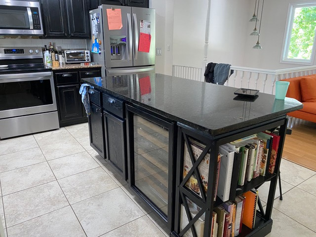
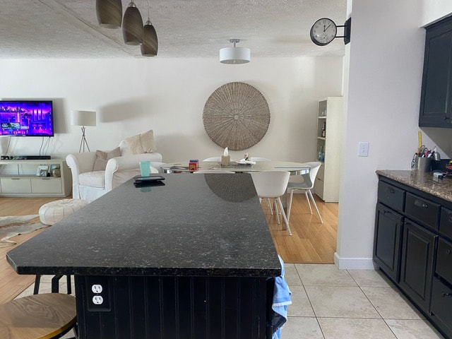
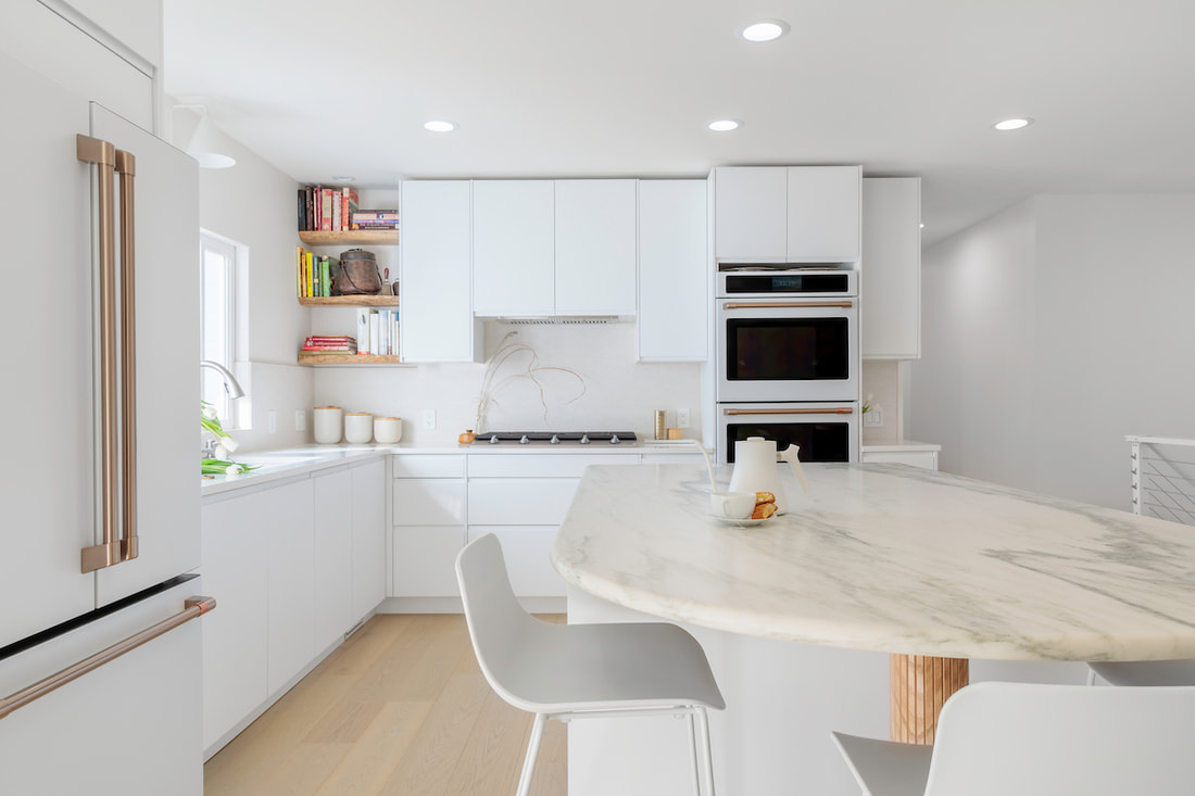
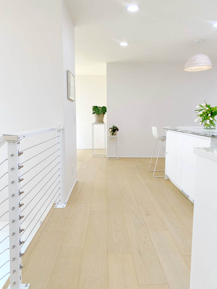
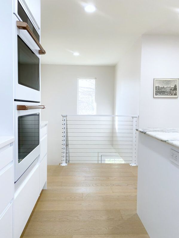
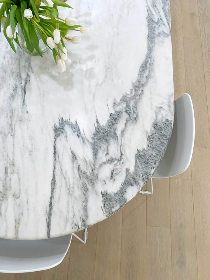
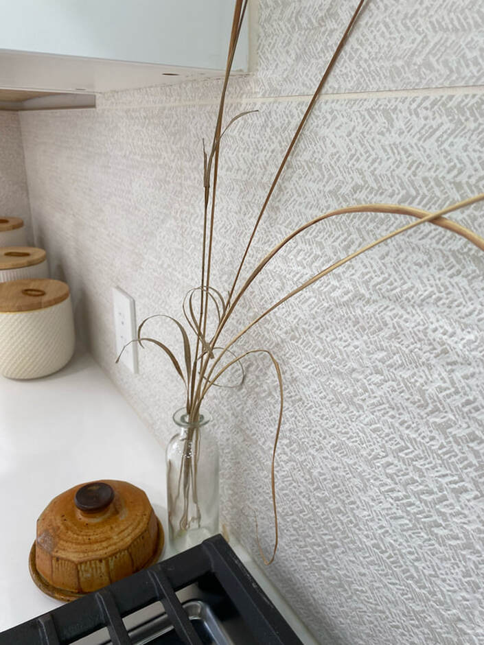
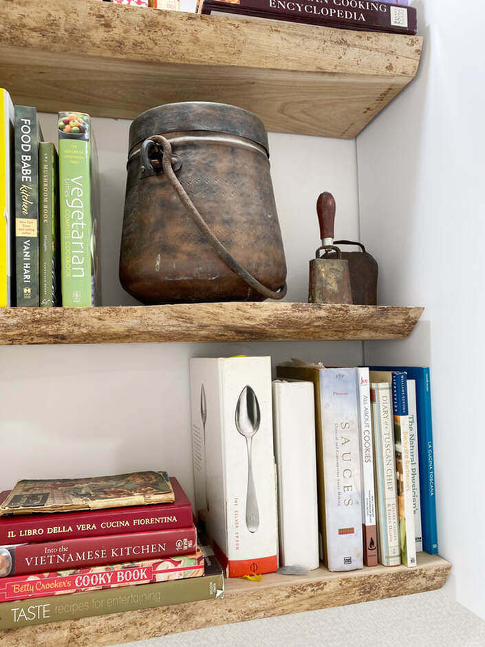
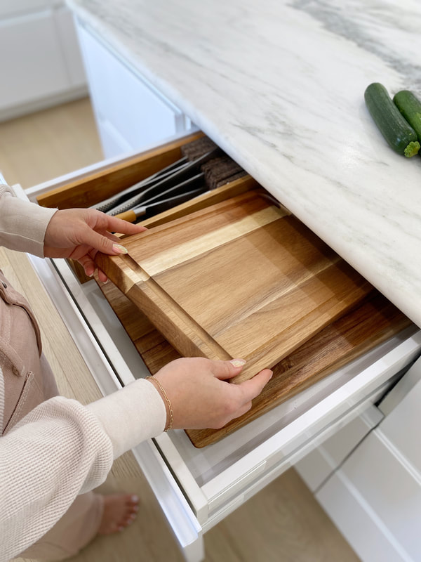
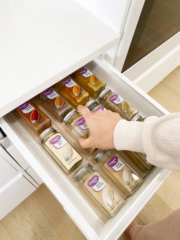
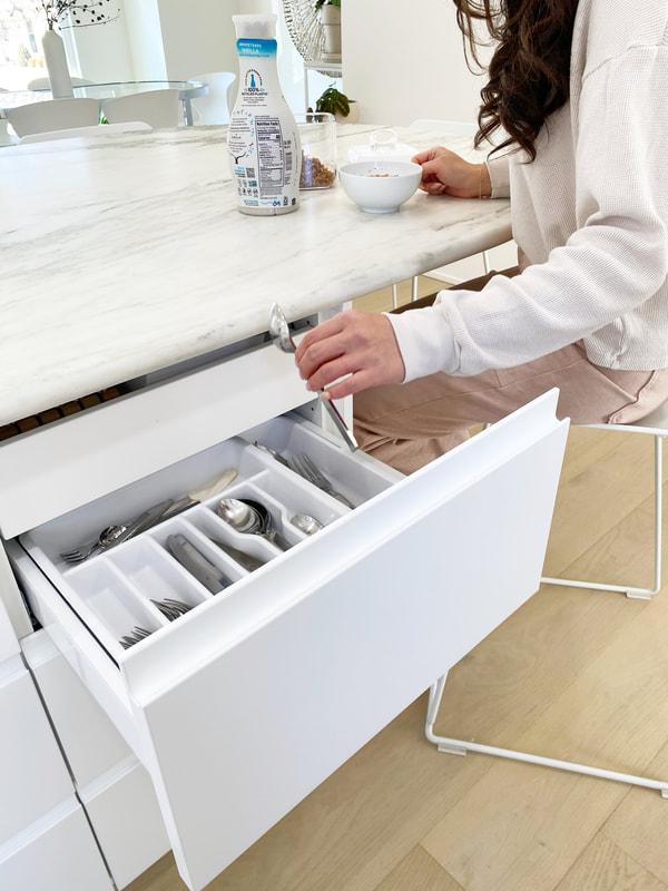
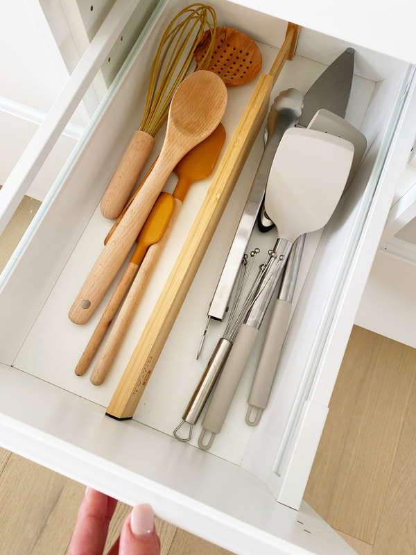
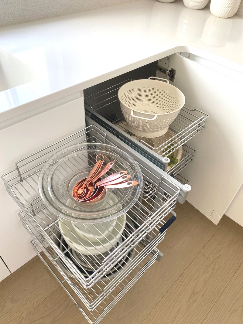
This post may contain affiliate links which help support our blog efforts. *Trade discount price Too many cooks in the kitchen sure, but never too many guests. In our home the kitchen is always the most popular spot in the house. Whether it's a parent coming to pick up their kiddo or a group of friends who coming over to share a meal, it's where we hang. It's like the kitchen is a magnet for people. It's always where people gather around to carry on a conversation, sip a beverage or enjoy a bite. Sorry living room :( This home is a perfect blend of Minimalist, Modern Organic and Quiet Luxury. The custom kitchen has to be the best example of high-low design in the home. High-low design is the pairing of high quality (=$$$) pieces with lesser quality (=$) pieces. Sound simple right? The majority of my clients don't have budgets that allow for all premium products and finishes. That's where my design super power kicks in. Making premium and economic finds work together to create one cohesive space. If you are looking to remodel the heart of your home make it work for you and your family. Don't worry about what the trends are or what others are doing. Make it more than a space that is more than a place to cook. (See full home addition and renovation here.) Because the kitchen would be the most used room in my house, I gave it extra attention in the planning stage. Not to mention a cash infusion here and there. We invested heavily in this custom space with a concentration on improved functionality. Swapping out base cabinets with fixed shelves and door fronts for slow close-drawers. Installing taller wall cabinets that reach the ceiling. And cleaver organizational systems peppered throughout. We significantly improved the spacial relationship of the major appliances. Improving the interaction we have with them and around them. The functionality wasn't the only upgrade for this kitchen remodel. While the footprint stayed the same, we overhauled the aesthetic. We invested in premium appliances with equally high-end aesthetics. We splurged on a slab of historic marble for the island counter top. We were also able to carve out a slim butler's pantry by throwing up a wall one end of the kitchen. I will do separate post in the future focused on that space. In terms of the high-low approach we saved by installing IKEA cabinets. Not only are they at a great DIY price point, they have a refined modern minimalist aesthetic. The IKEA Voxtorp door front has an integrated door handle and clean matte white finish. My husband and I wound up having to install the entire kitchen cabinets ourselves. We lost our installers due timing. But in order to not get further behind on the entire project we took this taks on ourselves. I had done a lot of research on best practices to installing IKEA cabinets and various "hacks". There is a lot of information about isntalling IKEA cabinets. I discovered a slew of comprehensive YouTube videos on the channel Up To Kode. Kody Harvey holds your hand with step-by-step instructions for installing an IKEA kitchen. From best purchasing the right pieces to finishing details. The key thing we learned was how to build and install plywood bases for the cabinets to make them extra sturdy. Before finalizing my cabinet layout was to allocate items to every drawer or cabinet. I printed out each cabinet section and hand wrote on it what goes where. Taking into consideration where we prep, eat, or empty the dishwasher. This allowed me to select the right size drawer or cabinet to accommodate the specific items. I got pretty granular for example, I counted the number of spices I had. Since I am right handed I instinctual reach to the right side first. So I split the spices into drawers on either side of the cooktop. The ones that I use more often I put to the right of my cooktop for easy access. The rest in a drawer to the left side. This sort of personalization is what truly makes a custom kitchen. Ok, nice patience and restraint to not skip right to the eye candy that are the after photos below. Not that I would blame you if you didn't read any of the copy up to this point and just scrolled through the pretty images. If you are curious about how I accomplished designing a modern white kitchen that is inviting. I wrote a little diddy about it below. After selecting all white cabinetry I disliked the idea shinny stainless appliances. They would break up the clean aesthetic making the space look choppy. Sadly a panel-ready fridge was out of my budget. So I was thrilled to find white appliances that were nothing like those basic styles of the 80's. The GE Café appliance collection has it all. A high-end aesthetic, quality finishes, and top rated functionality. The price point was on the top end of my budget. Actually it was out of budget. But I found a way to make it work because it's for the kitchen space. This was one of those cash infusions I mentioned in my intro paragraphs, but you probably didn't even read that part. While I love the GE Cafe appliances I skipped the GE Cafe dishwasher and I opted for a panel ready one. Part of my effort to keep a streamlined look. Unlike the fridge the panel-ready dishwasher could work was affordable. I didn't know any of the brands I found and turned to the advice of my appliance rep. He highly recommend the LG Signature Kitchen Suite. It was sound advice and it's been a wonderful addition. There is an ongoing debate about what is the best countertop surface. I read every article, twice. I compared all the usual suspects granite, quartz, quartzite, marble, limestone, and soapstone. And each of their brand names. I made lists of pros and cons of each material. One day I was wondering through rows of beautiful slabs at the final natural stone warehouse. When everything I thought wanted for my island countertop flew out the window. The instant I saw the striking greenish-grey veins washing through the creamy white surface, I knew I was done searching. It was a honed slab of Vermont Montclair Danby Marble - and it was mine. It reminded me of two of my favorite places on earth, Italy and the beach on the Atlantic ocean. Typically island seating is arranged one side of the counter. Except I wanted more social island seating. For eating, conversations and playing games after dinner. Since this is a custom kitchen I was able to design that works for my family. This meant an island with a pill shaped curve at one end. I also opted or a full bullnose edge which is not considered a modern detail. It's kind of a risky choice as the rounded edge isn't exactly modern. I was afraid I'd made a mistake with this organic edge, but it is perfect. It adds a visual softness to all the straight lines surrounding it. Not to mention lets the marbles veining flow and wrap around it organically. Typical an island overhang can be no more than 12-15" without support. My eating area overhang is 3' long by 4' deep. This called for some master planning and engineering. Not only did I want this large overhang eating area, I wanted maximum leg room underneath. I had my heart set on a "simple", minimal pedestal leg as seen in the above inspirational images. Fortunately, for me I knew just the person for this job. I enlisted the expertise of my husband, a design engineer. He came through with a custom support panel made of aircraft grade aluminum and 4.5" diameter pedestal leg made stainless steel. This isn't something you can order off Wayfair or Amazon. It is expertly designed, fabricated by professional, and installed with precision calibrations. (You can watch the videos on my Instagram account of the install.) In an effort to limit the amount of metal finishes I covered the pedestal leg with a fluted oak wood veneer. It is a material called "pole wrap" and purchased at HomeDepot. I sealed it with the same natural water based stain as our white oak stair treads. More natural material were brought into this modern space. First, with live edge shelves for all my cookbooks. I sourced them from a local sawmill where I was able to pick out the exact slab I wanted. Out of dozens of tree varieties we selected an Elm. Then we specified exactly where to cut it to capture the most interesting edge of the slab. More organic texture comes from white oak, engineered hardwood flooring and beautiful graining. I was comfortable saving thousands on on engineered versus solid hardwoods. It not only was installed in the kitchen but two thousand feet of the entire main level living area. The fact is it is an amazingly beautiful and durable product. Not to mention feeling on bare feet is warm and soft. The last surface installed in the kitchen was the backsplash tile. It is an oversized style with each piece measure 17"x47". The fine texture and muted color remind me of sandy beaches. Bringing things full circle. With the coastal landscape being my original inspiration for the entire home. Finally, it's that point in a project reveal post for the ugly before and inspiring after photos. If there is something you want to know more about or I didn't touch on leave a comment below. OR better yet e-mail me at [email protected]. Enjoy! BEFOREAFTERComments are closed.
|

